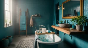


Japandi Kitchen ideas with Pastel Purple Calm (#B19CD9)
These Japandi Kitchen ideas start with the classics—warm wood, clean lines, and a “less but better” approach—and then add one unexpected (but incredibly livable) note: a Pastel Purple Kitchen in soft lavender #B19CD9. Used with restraint, pastel purple reads like a quiet haze rather than a candy color, and it can make a hard-working kitchen feel calmer from morning coffee to weeknight prep.
In my own projects, the magic happens when pastel purple is treated like a whisper: it’s present, but not shouting. The grounding comes from Japandi’s natural textures—oak, stone, linen—and the discipline of editing what stays on the counter. Below, I’ll break down how the color behaves in real kitchen light, the most flattering pairings, and the practical, step-by-step moves that turn inspiration into a space you actually enjoy living in.
Color Palette
Lavender Mist#B0A4BB
Warm Oak#A3806A
Soft Stone#E2DDDC
Dusty Lilac#BEB0BB
Gallery White#E5E6E7
Plum Shadow#846881
The Psychology of Pastel Purple in Your Kitchen
Pastel purple (#B19CD9) sits between soothing blue and energizing red, which is why it can feel both restful and gently uplifting—perfect for a kitchen where you’re constantly making small decisions. In a Japandi setting, I like it because it softens the visual “noise” of everyday life (appliances, backsplash lines, open shelving) without turning the room sugary or themed.
In practice, a Pastel Purple Kitchen behaves like a filter: it makes harsh whites feel friendlier and cool grays feel more human. It also shifts beautifully through the day—morning light can read airy and silvery, while evening light warms it into a cozy lavender tint. That’s why I almost always pair it with warm wood tones (oak, walnut) and matte finishes that reduce glare and keep the mood grounded.
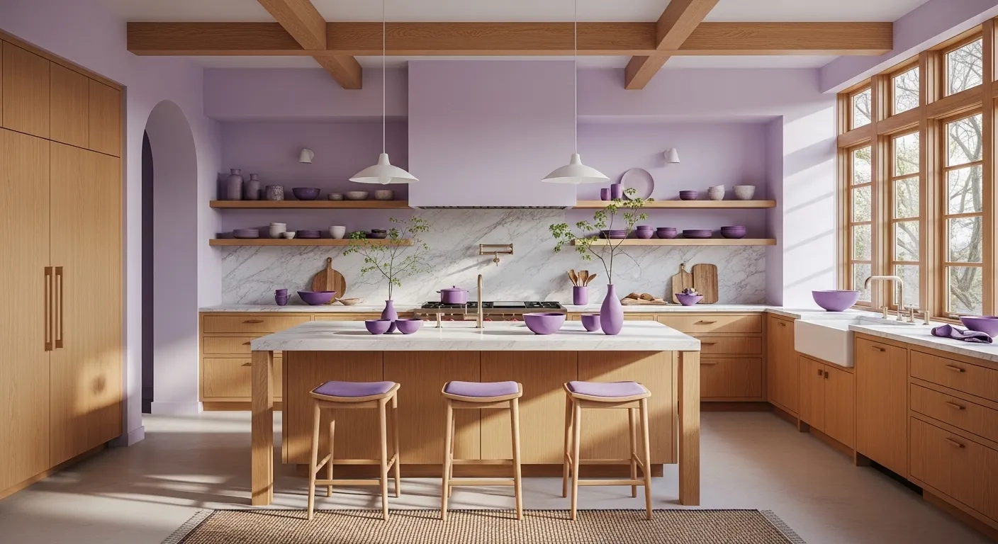
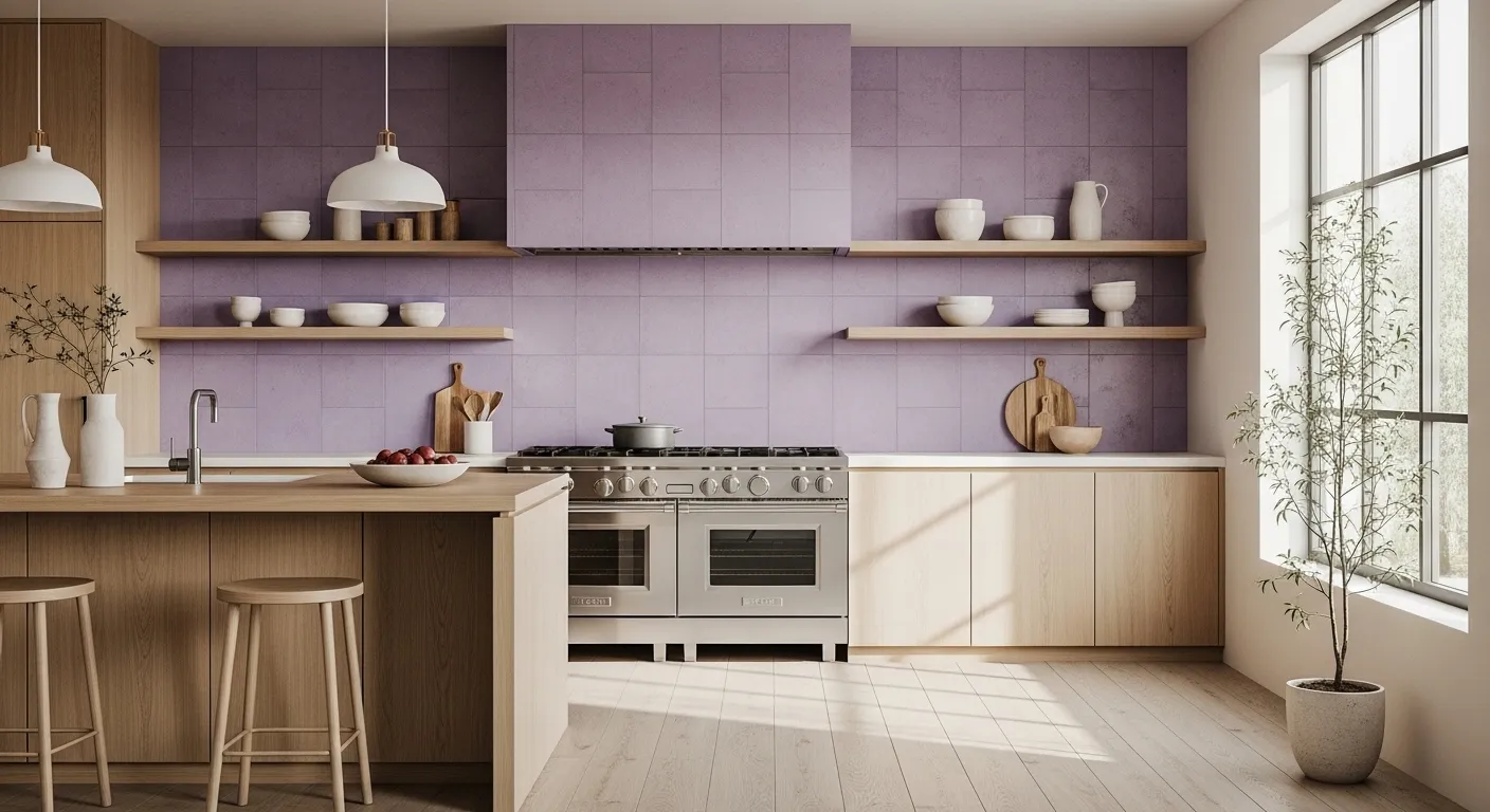
Notice in the wide shot above how the pastel purple reads calm because it’s supported by wood and stone—two “quiet” materials that are central to Japandi decor. One more everyday benefit: pastel purple tends to hide minor smudges better than bright white while still reading clean, which is a small luxury in the most used room of the home.
Color Combinations & Palette Ideas
The best Japandi Kitchen ideas with pastel purple rely on restraint: choose supportive neutrals, keep contrast intentional, and let natural textures do the heavy lifting. My rule is “one hero, two helpers, one anchor.” Pastel purple is the hero; your helpers are warm whites/greiges and wood; your anchor is a darker tone (charcoal, matte black, or deep plum-brown).
Four easy pairings that stay timeless
1) Soft Japandi Calm: pastel purple + warm white + light oak + sand beige. This reads bright and welcoming, and it’s the safest route if you want the color to feel like a gentle veil rather than a statement.
2) Modern Contrast (Still Cozy): pastel purple + charcoal + warm greige + natural wood. I use this when clients want a slightly more architectural look—charcoal makes pastel purple feel sophisticated instead of sweet.
3) Earthy Botanical: pastel purple + sage + cream + terracotta (tiny accents). Great for plant lovers; it feels organic and calm.
4) Minimal + Slightly Luxe: pastel purple + ivory + aged brass + walnut. This is my go-to when you want warmth and depth without adding visual clutter.
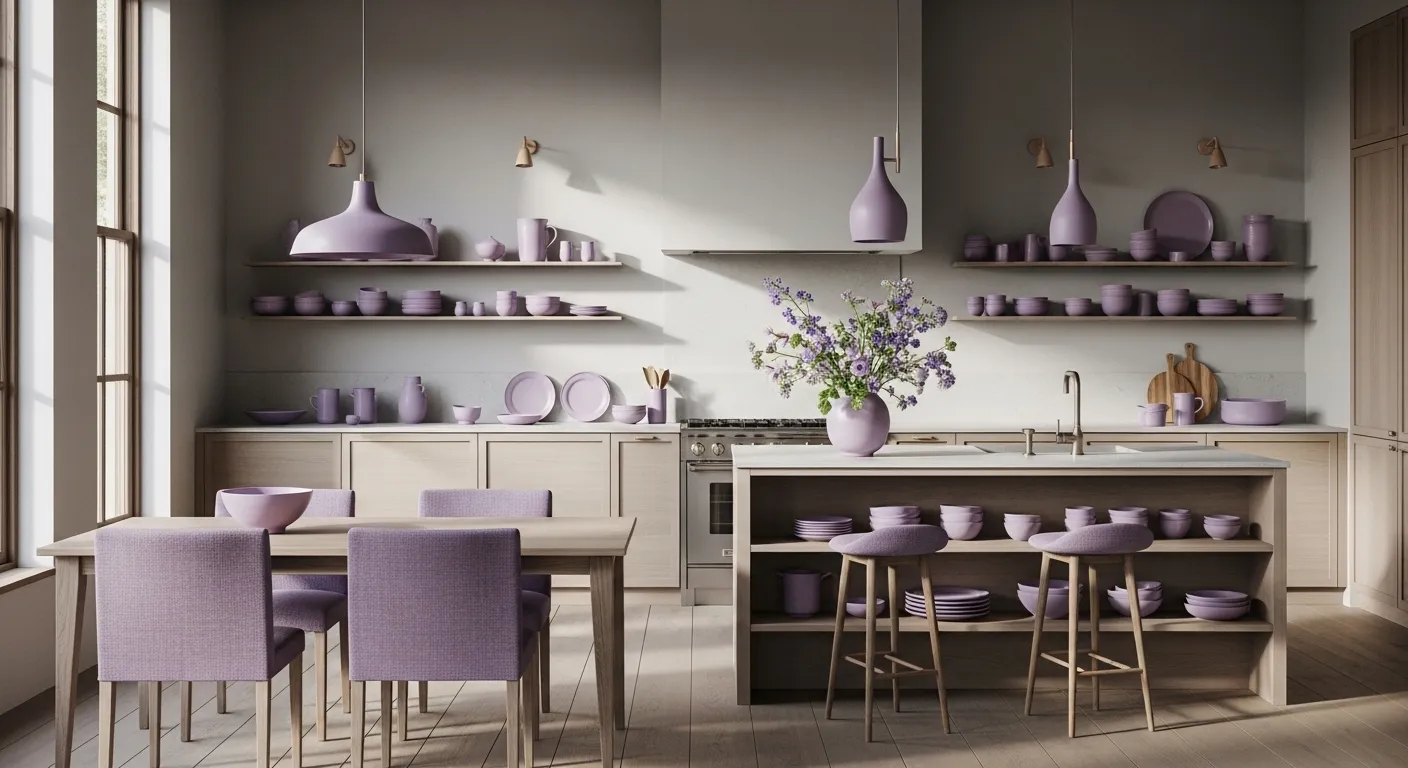
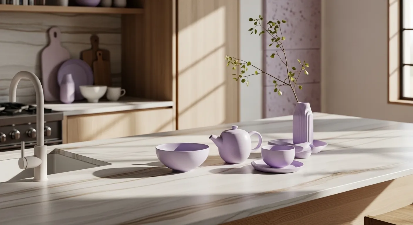
The vignette above shows a designer-friendly approach: instead of painting everything purple, echo it through ceramics and a few repeated touches. This is especially effective in rentals or in kitchens where you want to test-drive the color first.
Essential Furniture & Decor Elements
Japandi kitchens work because they’re edited: fewer shapes, better materials, and a clear purpose for what stays visible. When pastel purple is part of the plan, the supporting cast matters even more—you want the color to feel intentional, not accidental.
Cabinetry, surfaces, and fixtures that make pastel purple look grown-up
Cabinet fronts: Flat-panel or lightly Shaker styles feel clean and modern. For a balanced Pastel Purple Kitchen, I often specify purple on the lower run or island base (more grounded) and keep uppers in wood or warm white (more airy). It’s a classic Japandi move: visual weight low, breathing room up top.
Wood details: Light oak shelving, walnut stools, or a slim wood rail instantly “adult-ifies” pastel purple. Wood grain also provides gentle movement, which helps the kitchen feel calm but not sterile—core to Japandi decor.
Stone/stone-look surfaces: Warm white quartz, soft greige quartz, or honed dark surfaces pair beautifully. If you’re going darker, choose a matte or honed finish so it reads tactile and quiet.
Hardware: Keep it slim and simple: matte black for contrast, brushed nickel for softness, or aged brass for warmth. Avoid overly shiny finishes—Japandi is more about glow than sparkle.
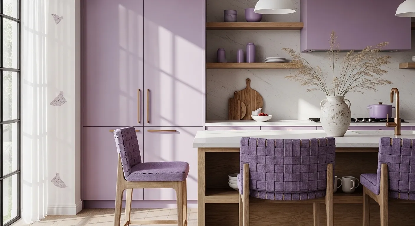
In the detail shot above, the success comes from repetition: the wood tone appears in multiple places, and the shelving stays curated. That’s the secret—Japandi doesn’t mean “no personality,” it means “personality with boundaries.”
Styling Tips & Budget Ideas
The most livable Japandi Kitchen ideas aren’t about buying more— they’re about making the everyday items look cohesive and calming. Start by choosing your “quiet triangle”: one wood tone, one light neutral, and one dark accent. Then let pastel purple be a gentle fourth note that repeats in two to four places.
Small moves that change the mood fast
1) Clear the counter like you’re staging a boutique hotel. Decant dish soap into a simple bottle, corral oils on a wood or stone tray, and store duplicates. A kitchen can be fully functional and still feel visually calm.
2) Go matte whenever possible. Matte paint, honed tile, and brushed metals keep pastel purple sophisticated. If you’re painting cabinetry, choose a washable matte/eggshell rated for kitchen wear.
3) Use “echo styling.” If your lower cabinets are pastel purple, echo it once in textiles (a linen towel) and once in a functional object (a utensil crock or bowl). Two echoes feel intentional; ten feel themed.
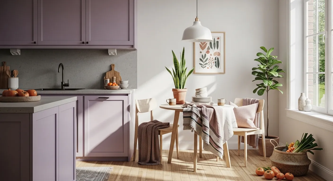
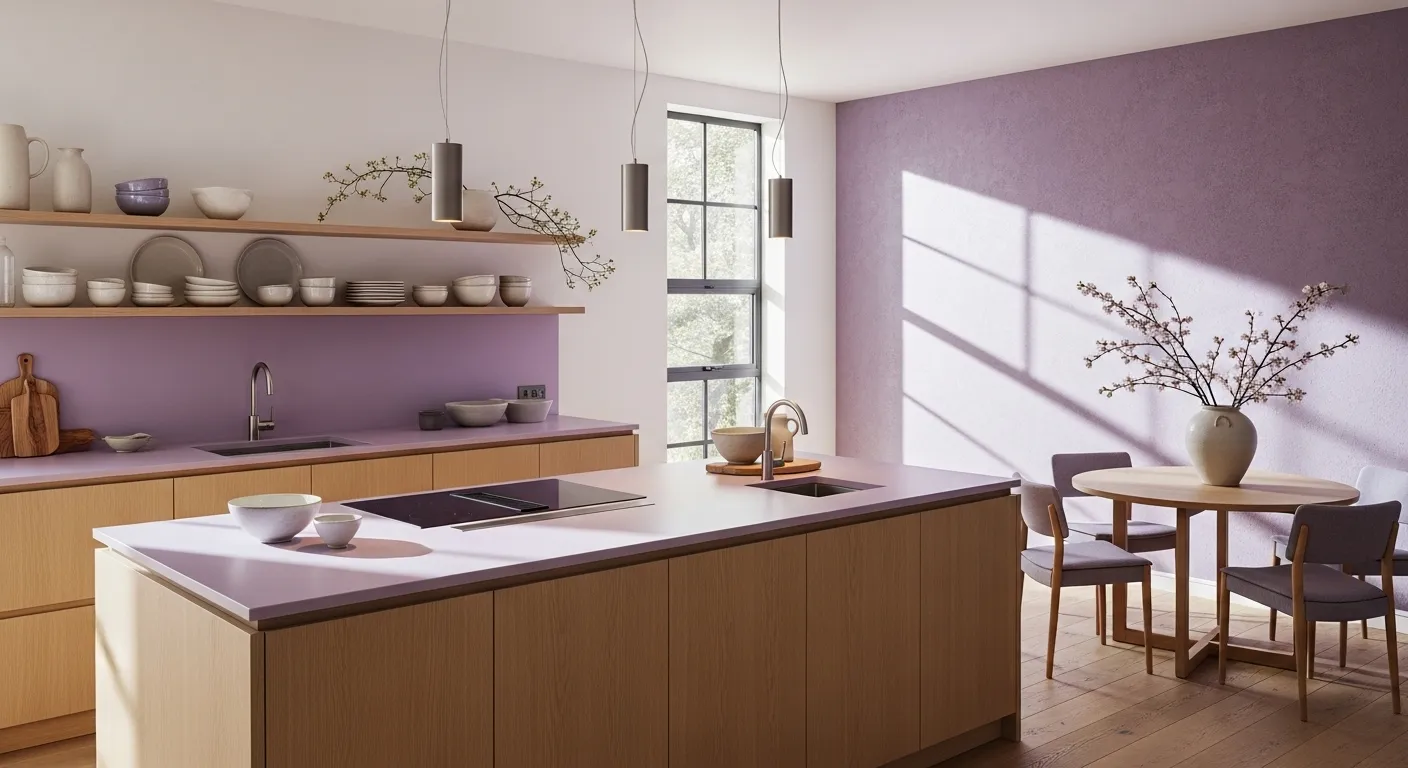
That breakfast nook moment is exactly what I aim for: soft color, warm wood, and a few plants to keep the space alive—calm vitality, not clutter. This is also where Japandi decor shines: a woven rug, a simple runner, and one sculptural pendant can do more than a shelf full of “stuff.”
How to Recreate This Look
Step-by-step plan (doable in a weekend or phased over time)
- Pick your “purple zone.” Choose one primary location: lower cabinets, an island base, a pantry door, or a backsplash. Concentrated color reads more designer than spreading it everywhere.
- Lock in the supporting neutrals. Choose a warm white or greige for walls/uppers, then commit to one consistent wood tone (light oak is the easiest Japandi match).
- Choose the right surface finish. Aim for matte/honed: a honed-look quartz, a satin ceramic tile, or a slab-look panel. This is where the calm comes from.
- Edit your storage. Before you buy decor, reduce what’s visible: matching jars, fewer countertop tools, and intentional shelf spacing.
- Add two functional “beauty objects.” Think: a stoneware utensil crock and a simple tray, or a vase with a branch and a cutting board leaned against the backsplash.
If you’re unsure where to place the color, the backsplash idea above is one of my safest recommendations—tile gives you texture, and pastel purple stays contained.
Use the island styling moment as your template: repeat color through everyday items (ceramics), keep shapes simple, and let one natural element (a branch) bring in that wabi-sabi softness.
The full-room view above is a great reminder: the “Japandi” part is the restraint—clean lines, warm daylight, and a deliberate lack of visual chaos.
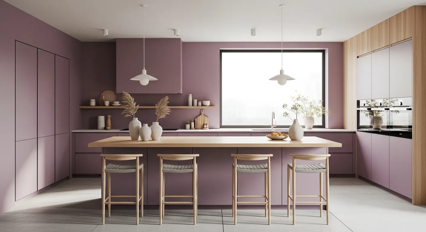
When you’re ready for a bigger commitment, pastel purple cabinetry (as shown above) looks best when the pendants, hardware, and styling stay minimal and consistent.
Budget
Low Budget: $250–$900 (best for rentals or quick refreshes)
- Paint (walls or pantry door): $60–$180
- Hardware swap (10–20 pulls): $80–$240
- Pendant or flush light (1 fixture): $70–$250
- Textiles + shelf styling (linen towels, tray, stoneware): $40–$230
Mid Budget: $2,500–$8,500 (targeted upgrades that feel like a mini-reno)
- Professional cabinet painting (lower cabinets or island): $1,800–$5,500
- Backsplash retile (materials + labor): $700–$2,200
- Lighting + electrician (1–2 fixtures): $350–$800
FAQ
1) Will pastel purple make my kitchen look childish?
Not if you ground it with wood, stone, and matte finishes. Keep the purple concentrated (lowers, island, backsplash) and let warm neutrals dominate.
2) What’s the easiest way to try a Pastel Purple Kitchen without remodeling?
Start with paint on a pantry door or a single wall, then echo it through towels or ceramics. You’ll see how it behaves in your light before committing.
3) Which hardware finish works best with pastel purple in Japandi?
Matte black for crisp contrast, brushed nickel for softness, and aged brass for warmth. Choose one finish and repeat it consistently.
4) Can I mix pastel purple with white cabinets?
Yes—use pastel purple on the backsplash or island and warm the whites with oak shelving, woven textures, and 2700K–3000K bulbs.
How to Recreate This Look
Step-by-step plan (doable in a weekend or phased over time)
- Pick your “purple zone.” Choose one primary location: lower cabinets, an island base, a pantry door, or a backsplash.
- Lock in the supporting neutrals. Choose a warm white/greige plus one consistent wood tone (light oak works beautifully).
- Go matte/honed. Prioritize low-sheen finishes for paint, tile, and metals to keep the look calm.
- Edit what’s visible. Matching jars, fewer countertop tools, and breathing room on shelves create instant Japandi order.
- Style with repeats. Echo pastel purple in 2–4 places (ceramics + textiles) for a cohesive result.
Budget
Low Budget: $250–$900
- Paint: $60–$180
- Hardware: $80–$240
- Light fixture: $70–$250
- Textiles/ceramics/tray: $40–$230
Mid Budget: $2,500–$8,500
- Professional cabinet painting: $1,800–$5,500
- Backsplash retile: $700–$2,200
- Lighting + electrician: $350–$800
FAQ
1) Will pastel purple look childish?
Not when balanced with warm woods, stone, and matte finishes.
2) Easiest way to test pastel purple?
Paint a pantry door or small wall, then add purple ceramics or towels.
3) Best hardware finish?
Matte black, brushed nickel, or aged brass—pick one and repeat.
4) Can I use it with white cabinets?
Yes—keep white warm and add oak + warm lighting.
Final Thoughts
If you’ve been looking for Japandi Kitchen ideas that feel calm but not bland, pastel purple (#B19CD9) is a surprisingly timeless direction when you treat it like a soft accent and support it with wood, stone, and edited surfaces. A Pastel Purple Kitchen works best when the layout stays simple, the finishes stay matte, and the styling repeats intentionally—exactly the principles that make Japandi so livable. Start small, observe your light, and build your palette step-by-step; you’ll end up with a kitchen that feels quieter every time you walk into it.